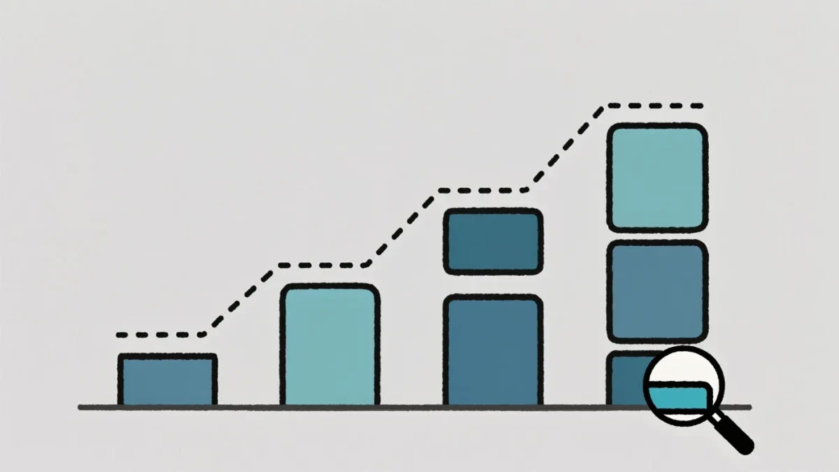
Meta has published enforcement transparency data since the late 2010s and now reports actioning billions of fake accounts per period; X and TikTok publish comparable government-request and moderation reports. These documents are a genuine evidentiary resource — and simultaneously a public-relations product. Reading them well means knowing which numbers carry meaning and which are designed to impress. The discipline is the same one this site applies to any claim: definitions, denominators, sources and dates.
What is actually in a transparency report?
Four families of numbers. Content removals: posts, accounts and ads actioned by category. Government requests: data demands and takedown orders by country. Appeals: how often users challenged decisions and won. Proactive rate: how much enforcement the platform says it caught before users reported it. Each family answers a different question, and mixing them — as press summaries often do — produces nonsense.
Why do raw removal counts mislead?
Because count is not prevalence. A platform removing 20 million hate speech posts in a quarter sounds heroic until you ask two questions: how much hate speech existed in total, and what counted as an instance? Meta's reports define an action per piece of content and report proactive percentages precisely because raw totals cannot be compared across platforms with different definitions, detection systems and user volumes. A bigger number can mean a worse problem, not better enforcement.
What is the proactive enforcement metric?
It is the share of enforcement the platform attributes to its own detection rather than user reports. A rising proactive rate is presented as systems working. But it measures detection mechanics, not accuracy — automated detection can be wrong at scale, which is why the appeals data matters as the counterweight. Where reports show large enforcement volumes alongside thin appeal outcomes, the honest reading is that speed is measured and error is undermeasured.
Why do definitions matter more than totals?
Because categories are policy choices. What one platform files under spam, another files under harmful organizations; the same video can be counted as violent content, misinformation or graphic media depending on the rubric. Reuters reporting on moderation disputes has repeatedly shown how classification drives both enforcement and the resulting statistics. Cross-platform comparisons of raw counts are therefore comparisons of definitions, not of safety.
Five questions for any transparency figure
- Definition: what exactly counts as an action in this category?
- Denominator: actioned out of how much total content?
- Baseline: rising or falling across periods, and why?
- Appeals: how often were decisions overturned?
- Source: platform self-report or externally audited?
Can these numbers be trusted at all?
Partially and structurally. They are self-reported by the party with the strongest interest in the numbers looking good, and audit coverage varies. But they are internally consistent over time, the reporting frameworks have been shaped by regulators including under the EU's Digital Services Act regime from the early 2020s, and independent researchers do catch discrepancies when definitions quietly change. The correct stance is documented skepticism: use the series, footnote the source, distrust cross-platform rankings.
What should a reader take from a transparency report?
Trends and mechanisms, not league tables. A category growing for four quarters tells you where pressure is rising. A high proactive rate tells you automation dominates. A low reversal rate on appeals may tell you appeals are weak, not that decisions are right. Transparency reports are the platforms' testimony about themselves — admissible, useful, and never sufficient. Like every source this site covers, they get verified, not believed.
What should change in how you read coverage of them?
When a headline quotes a transparency number, ask which family it belongs to and what changed in the definitions that year. Report the series, not the snapshot: enforcement totals swing with policy changes, product launches and staffing at moderation teams, and a record quarter often tells you more about a new detection system than about new behavior. Be doubly careful with comparisons across platforms — definitions, user bases and detection methods differ too much for league tables to mean anything. The reports earn their value in trends, in government-request totals, and in the gaps they reveal when categories quietly shrink. Treat them the way this site treats any named source: citable, dated, and checked against independent reporting before any number earns a headline. That is not cynicism. It is the same standard applied everywhere else, applied to the companies publishing their own report cards.
For more context, read Follower Inflation: How Fake Audiences Are Detected and Priced.
For more context, read tiktok rumors.
For more context, read Fake News on LinkedIn: Why a Business Context Lowers Guard.